


B2 Processing/Max/Syphon/Resolume Demo
Introduction I recently had the chance to build something in the Atlas B2, a cool space that has multiple projectors, mocap, lights, and 40-speaker surround sound. I’d done a number of cool …
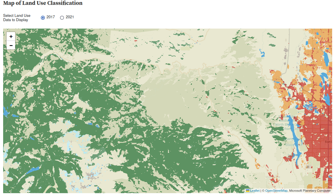
This project uses the 10m Annual Land Use Land Cover (9-class) dataset which is a joint project between ESRI & Impact Observatory. I chose to use the version hosted on the Microsoft Planetary Computer because it’s very accessible to web users.
The 10m Annual Land Use Survey is created by feeding ESA Sentinal-2 imagery into a Deep Neural Network run on Microsoft’s Planetary Computer. Each 10x10m square of the grid is classified into a 9-category system and these are displayed color-coded on the map. The Neural Network was developed by Impact Observatory and uses a massive human-labeled dataset as its training data.
I first became aware of this dataset when Joseph Kerski gave a talk to our Case Studies class and became interested in its potential for observing changes. As a satellite product, it provides a consistent quantifiable and repeatable set of data, and it’s already available for a four-year period, which gives us plenty to look at.
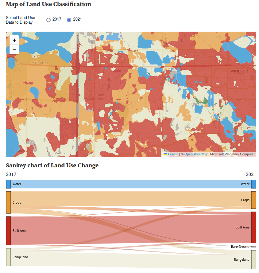
My final product here is an ObservableHQ Notebook which looks at the changes in land use in Northern Colorado.
There are a few main steps to making this work in the browser
I decided to build the whole thing on Observable hoping it’d be easier than a straight webpage, though this probably isn’t strictly true. The general processes should however be usable in plain Javascript.
The Planetary Computer Data Catalog doesn’t give a lot of clues about how to access this data from Javascript (and I certainly don’t want to process the large GeoTIFF files that make up the source data, tutorials here if that’s your thing).
You can however view the data live on in the Planetary Computer Data Explorer so this gave me a pretty good clue that it was possible.
The Data API page shows various methods for fetching times which appear to be compatible with the Tile Map Service schema which should work, the biggest challenge was identifying all the necessary parameters to get the right data
| Parameter | Selected Value | Notes |
|---|---|---|
| z | Comes from the Leaflet mapping application in the browser | This is zoom, not a 3d coordiate |
| x, y | These come from the Leaflet mapping application in the browser | These are the tile index within the selected zoom level |
| collection | io-lulc-9-class | |
| item | 13T-2017 | This is the 2017 for MGRS zone 13T (more on this below) |
| assets | data | What else would you want?! |
| colormap_name | io-lulc-9-class | This colorizes them the same way they appear in the demo |
Here’s how that looks when I put it into a Leaflet tileLayer:
  let pcLayer2 = L.tileLayer( 'https://planetarycomputer.microsoft.com/api/data/v1/item/tiles/{z}/{x}/{y}.png?scale=1&collection=io-lulc-9-class&item=13T-2017&assets=data&colormap_name=io-lulc-9-class', {
      attribution: 'Microsoft Planetary Computer'
  }).setOpacity(0.3).addTo( myMap );
The “item” above contains the string 13T which refers to the Military Grid Reference system. This carves up the world into a bunch of zones that you can see here
This unfortunately means you can’t just scroll around on my Observable notebook to view the rest of the world because Leaflat map doesn’t automatically switch tilesets. I believe it would be possible to extend the Leaflet tile layer, using the technique described here to calculate and inject the proper MGRS code, but I haven’t got round to that yet.
I found an old library called “leaflet-image” which allows javascript to extract the image of a leaflet map for further processing. I forked this and added a layer selector so I can extract each layer individually.
One bug in the original code means that it doesn’t consider layer opacity when creating the image, this works to my advantage as I can toggle the layers by making one of them transparent, but when I need to analyze them the transparent layer is output in its original opacity.
I can then use code like this
// Define a selector to get only the layer called "2017"
let ls2017only = function(l){ return l.name=="2017";}

LeafletImage(map, ls2017only, function(err,canvas2017) {
    // Process the canvas2017 object created from this layer
}
The 9 Land Use classes are described here
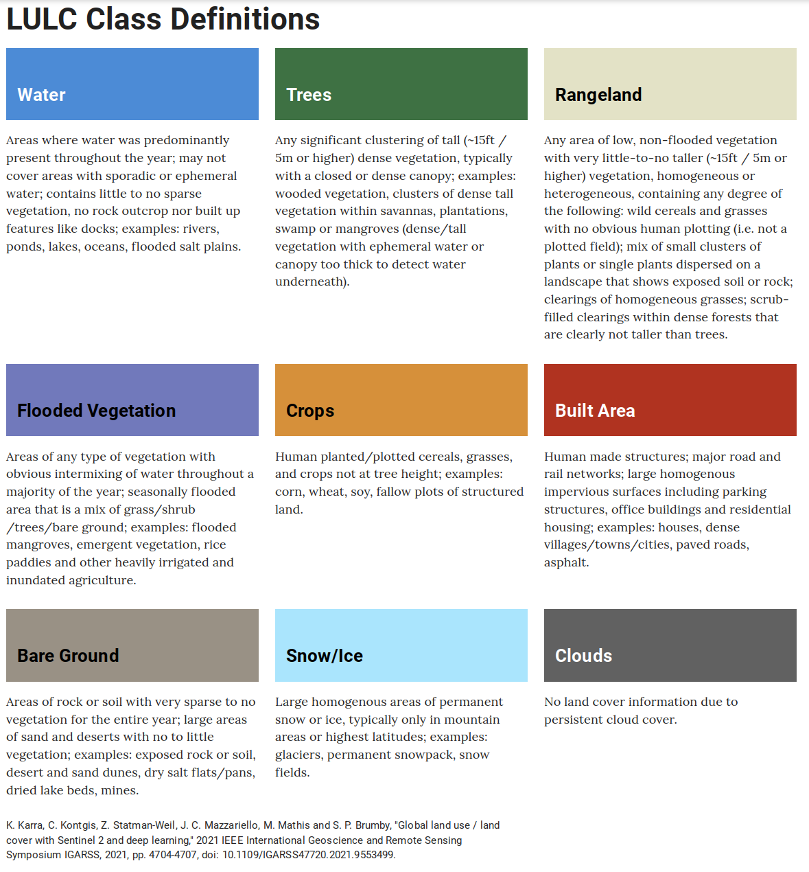
Conveniently, each class has a different Red Pixel value, so I can differentiate them with
  const NO_DATA =0;           //255,255,255
  const WATER=1;              // 65,155,223
  const TREES=2;              // 57,125, 73
  const FLOODED_VEGETATION=3; //122,135,198
  const CROPS=4;              //228,150, 53
  const BUILT_AREA = 5;       //196, 40, 27
  const BARE_GROUND=6;        //165,155,143
  const SNOW_ICE=7;           //168,235,255
  const CLOUDS=8;             // 97, 97, 97
  const RANGELAND=9;          //227,226,195


switch (redPixel)
{
    case 65: return WATER;
    case 57: return TREES;
    case 122: return FLOODED_VEGETATION;
    case 228: return CROPS;
    case 196: return BUILT_AREA;
    case 165: return BARE_GROUND;
    case 168: return SNOW_ICE;
    case 97: return CLOUDS;
    case 227: return RANGELAND;
}
Each time the map moves, I extract each layer to a canvas and then iterate over every pixel, building a dictionary of the number of pixels that move from one class to another.
Next, I need to convert the pixel count into acres (this hurts my metric sensibilities, but it’s more relatable in the US). I borrowed this code from another javascript library that computes the on-the-ground area of a rectangle on a spherical planet.
  const SQM_PER_ACRE = 4046.86;
  const WGS_EARTH_RADIUS = 6378137.0; // used to calculate areas

  // ripped from the Leaflet-draw library because it wasn't happy being included here and is total ovekill
  let geodesicArea = function (latLngs) {
      var pointsCount = latLngs.length,
      area = 0.0,
      d2r = Math.PI / 180,
      p1, p2;

      if (pointsCount > 2) {
          for (var i = 0; i < pointsCount; i++) {
              p1 = latLngs[i];
              p2 = latLngs[(i + 1) % pointsCount];
              area += ((p2.lng - p1.lng) * d2r) *
              (2 + Math.sin(p1.lat * d2r) + Math.sin(p2.lat * d2r));
          }
          area = area * (WGS_EARTH_RADIUS*WGS_EARTH_RADIUS) / 2.0;
      }

      return Math.abs(area);
  }
I can use this to calculate the area of the map extent and then divide through to compute acres-per-pixel which is then multiplied with the pixel counts I arrived at earlier.
This assumes all the pixels in the map are the same size, this is a reasonable approximation for Colorado, but would be more problematic if you viewed a large area near the north pole as the more northernly pixels would be distorted.
This turned out to be a giant pain in the ass because I wanted to keep the colors from the original map scheme and the way that the D3 Sankey is implemented in Observable didn’t support this.
I wound up having to make a fork of their Sankey implementation that exposes an adjustNodeColor method that can be used to change the color of a node.
The final chart code looks like this
chart = SankeyChart({links: Data.sankey},{
    nodeGroup: d => d.id.split(/\W/)[0],
    width,
    format: (f => d => `${f(d)} Acres`)(d3.format(",.1~f")),

  // Had to fork the built in Sankey Library so I could make the colors match the Land-Use classes
    adjustNodeColor: (c,t)=>
   {

     switch (t.split(/[\W\n]/)[0])
     {
       case "Water":
         return "#419bdf";
       case "Trees":
         return "#397d49";
        case "Rangeland":
         return "#e3e2c3";
       case "Crops":
         return "#e49635";
       case "Built":
         return "#c4281b";
       case "Bare":
         return "#a59b8f";
       case "Snow":
         return "#aaeafd";
       case "Flooded":
         return "#7a87c6";
     }},
    height: 300})
You can look at all the final results on Observable](https://observablehq.com/@grahamsz/colorado-land-use-changes). All the code is in there and can be viewed, but a lot of the key setup code is buried at the bottom of the project.
I chose to focus on my local area because I felt like I knew it well. Even then it’s hard to get a sense of scale, many of the wildfire burn areas were much larger than I’d expected. In other places I was surprised by how hard it was to find areas where farmland was converted into homes (even though it feels like it’s happening on a massive scale).
Introduction I recently had the chance to build something in the Atlas B2, a cool space that has multiple projectors, mocap, lights, and 40-speaker surround sound. I’d done a number of cool …